Found this great designer's work via bookcoverarchive.com where he is often featured.
Oliver Munday is an American designer, currently working in Washington DC, where he has founded a design studio. His work is very wide ranging and goes beyond just print applications, and the sheer size of his portfolio and quality evident in his work is inspiring. He is also a long-time contributor for the New York Times, often responsible for illustrating articles and publications.
He definitely has his designing career pretty much sorted for the near future, and his immense body of work should mean that he never has trouble finding employment or new clients. Seeing other successful designers always motivates me, and his level is definitely something to try and aim towards in the next few years.
Though i've never had a particularly great interest in animation or the origins of the 'cartoon', since learning of the Felix the Cat cartoons' existence i've been meaning to blog about them, but never got round to it until now. Felix the Cat is a often overlooked animation series that began in the 1920's and has been running off and on in various forms since then (apparently due to make a comeback sometime in the near future, having all but disappeared for the last few decades).
It marked the start of the popularity of animated characters in the silent film era of the early decades of the 20th century, and actually existed a fair few years before Disney began their Mickey Mouse cartoons, arguably making it responsible for Disney's success with the character (whose shorts marked the start of specifically recorded soundtracks in animation).
The animations are brilliantly executed considering the limitations the artists had at the time, with a lot of care and attention put into the themes, art direction, and cultural relevance. The character Felix himself shares a lot of similarities in fact with Mickey Mouse, so it's sad that the character that inspired Disney's breakthrough animations was in the end killed off by them, since Felix's popularity dropped as audiences preferred Disney's non-silent style of film.
Part of what I thought makes the 1920's/1930's Felix films great is the offbeat, surreal nature of the animation and storylines. Below is the 'Woos Whoopee' film from 1928 (during the 'Prohibition' period in the USA), in which Felix goes to an illegal 'speakeasy' club to get wasted, which US audiences lapped up at the time. It's strange and fascinating to see this sort of cartoon art style mixed up with controversial and 'adult' themes, but for me these films seem to have a lot more personality and charm than a lot of modern-day equivalents, and it's a shame the character never really got the widespread recognition he deserved.
One of the greatest things about this particular film is the timeless nature of it. Audiences today (at least those that drink) can relate to it, even nearly a century later and in completely different societies/cultures. Who can honestly say that when drunk they've never danced on top of a table, or stolen someone's drink, or got completely lost on the walk home and ended up getting back at 6AM? Though i'm not so sure about being chased by elephants or following walking lamposts...
Though the value of the typeface (or lack of it) is becoming an incredibly tired 'debate', the reputation of Comic Sans, as well as the history and reasoning behind its creation, is well documented in an interesting BBC article that appeared on the site yesterday.
Particularly interesting was the discussion of how typeface has become an ever more considered element of everyday work, whether it be graphical or otherwise. Before the dawn of computer technology for the masses, the general public would not give a second thought to the application or choices of different typefaces in the world around them, whereas now every man and his dog, not just the designer, has an opinion on them and is prepared to go to great lengths to let the world know about it via the medium of the internet.
Also noteworthy was how the trend to slag off the typeface has almost come full circle, and it's threatening to 'make a comeback' and gain some sort of value as a retro-chic/ironic typeface choice. Hopefully that day never comes, and it rests within the primary school signage/comic strip speech bubble applications where it belongs.
As part of a current university design brief we have been tasked with building up a brand identity, so when I saw this post on Under Consideration's 'Brand New' blog, I immediately found it fascinating, not to mention highly useful. It documents US kid's TV channel 'The Hub' and their recent rebranding effort, complete with a chart of unused brand mark options that were explored during development of the new identity.
It's not often you get an inside look like this into the process of a major rebranding effort, so it is a good opportunity to get some information about what sort of range of exploration you should undertake when developing a new mark.
As you can see from the image above there are well over a hundred executions considered (though there are ranges of very similar efforts but with slight adjustments). Though it may not be necessary to always go into such depth to find a good mark, the fact that the new identity is being received well shows that it pays off to exhaust all the possibilities before settling on a final execution.
Found this great packaging for new coffee brand Brothers Coffee Roasters on the 'thedieline' blog.
"Coming from a science background, Nathan (the roaster behind Brothers Coffee Roasters) has approached roasting coffee with the same methodical reasoning as science. Using this as inspiration, the marque created for Brothers takes reference from the periodic table while the full logotype is inspired from the process of roasting the coffee. A whole range of 12 blends are in production, all featuring a different coloured circle on the packaging to appropriately represent the blend."
I'm really liking the minimal and clean design, with the focus on the colour coding of the different blends and the nicely executed logotype and supporting information. I always find it refreshing to see retail packaging go for a sophisticated 'less is more' approach, rather than bombarding the consumer with pointless information and offers plastered across the box with little thought towards weighting or placement.
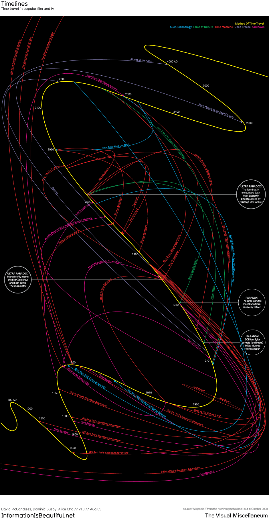
Found this infographic via coolinfographics. Love the simple visual style and presentation, though perhaps the designer has included a few too many films/tv shows to make the infographic as legible as it should be.
These water fountain installations by William Pye use an interesting dynamic to completely flip the normal idea of how a water fountain traditionally works. His cylindrical acrylic structures are filled with water, pumped in a circular motion and programmed to rise and fall within the cylinder, which creates a 'vortex' air pocket in the center of the cylinder. I love the simple style of his constructions and visual effect they produce.
This installation was placed in the departure lounge of Gatwick Airport North Terminal, but he has done similar installations in other places around the UK.
Stumbled across this nice concept piece for a Nescafe print ad (I say concept piece, but i'm just assuming that it isn't official due to the poor English in the copywriting). I'm a sucker for anything typography based, so this simple and unassuming design paired up with a solid concept really grabbed my attention. Would be perfect for a series of adverts running up and down escalators at Tube stops, or just as single executions within public transport networks.
Large scale LEGO structures are nothing new, and nothing will ever really be particularly impressive after James May's effort, though then again that project had over 1000 participants, whereas this project was the result of just two people, namely the Parisian design duo Simon Pillard and Philippe Rosetti. Even just the general decor of their house is enviable, but it's inspiring to see designers take their more ambitious ideas outside of the digital medium and integrate them somewhere as intimate as their own living spaces.
More photos of their impressive setup can be found here.
I recently read up a little bit about the Gap rebranding saga, and it reminded me a lot of Tropicana's failed rebranding effort last year (see this post).
Not much to comment on about the actual new logo, except for the fact it is very generic, uninspired and pretty averagely executed. Though I don't disagree with the use of Helvetica in principle (it is a classic font and will always be brilliant, despite being overused) American Apparel did the 'black Helvetica' logo first, and much better too. The square couldn't have been positioned in a much worse place and the gradient is pretty horrible and unnecessary.
However whereas Tropicana's effort lasted around a month before they quickly backpeddled, only a few days after unveiling the new branding Gap have backtracked and even called upon designers via Facebook to have a go themselves at creating a new logo.
Unfortunately this has made the vitriol around the internet towards Gap even more intense, as most designers feel it is cheapening the profession and the value of design work. A particularly good example of this is a blog post by this designer, who has claimed to have created a perfect new logo for Gap, but is expecting a promise of payment if it is chosen (probably a joke, but his post makes a lot of good points).
Though Gap must be enjoying the attention they're getting right now, failures like this can surely only harm the brand in the long term (Tropicana reported significant drops in profit following their unpopular rebrand). There was nothing particularly wrong with Gap's old logo, and despite being in use for over 20 years, it doesn't really strike me as desperately needing a redesign. I'll be interested however to see what happens next, and what branding Gap opts for, whether they end up picking one of their crowdsourced solutions, go back to the previous logo, or keep their unpopular new branding.
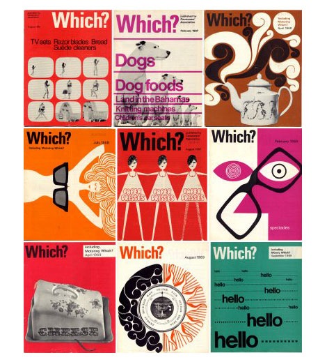
Great selection of Which magazine covers from between 1960 to 1981. Beautiful composition, typography and graphical finesse on these covers, and a far cry from the generic photoshoot product images on the covers in recent years. I'd like to know who the art director was during that period.
Thanks to the Delicious Industries blog for finding and uploading these old covers, and more of these glorious covers can be found here.
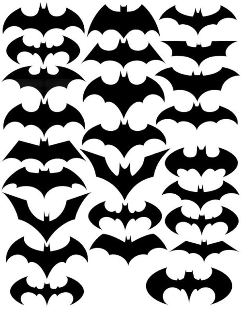
Saw this post on Under Consideration's Brand New blog. Never had a particular passion for Batman or comics in general (except the recent films) but I enjoyed this look at the variations and 'evolutions' of the logo. It's impressive how each iteration has taken on a unique style and tone, despite working within the same tight constraints of size, general shape/form, and colour. For example, the Dark Night comic version, seen in the video below, uses a far more angular and edgey design approach to suggest a more sophisticated or adult tone in the comic series. Looking at this collection of logos provides a good incentive to really explore more options during brand mark development, as there are literally almost endless iterations to experiment with and always more options and tweaks available.
Here's a pretty nice video which is more or less chronological, and morphs the versions into each other. It also seems to have a couple of versions that aren't in the above image, and vice versa.


