
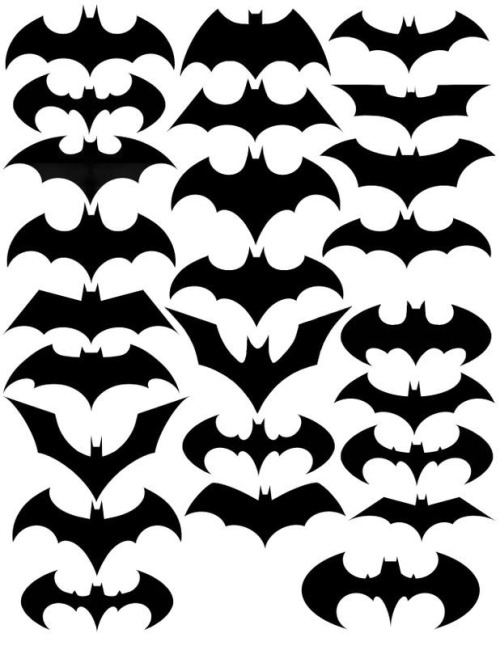
Saw this post on Under Consideration's Brand New blog. Never had a particular passion for Batman or comics in general (except the recent films) but I enjoyed this look at the variations and 'evolutions' of the logo. It's impressive how each iteration has taken on a unique style and tone, despite working within the same tight constraints of size, general shape/form, and colour. For example, the Dark Night comic version, seen in the video below, uses a far more angular and edgey design approach to suggest a more sophisticated or adult tone in the comic series. Looking at this collection of logos provides a good incentive to really explore more options during brand mark development, as there are literally almost endless iterations to experiment with and always more options and tweaks available.
Here's a pretty nice video which is more or less chronological, and morphs the versions into each other. It also seems to have a couple of versions that aren't in the above image, and vice versa.
where's the dark knight returns logos?
ReplyDelete